FUNDHOUSE
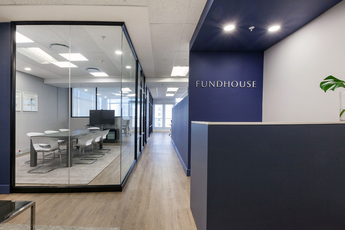
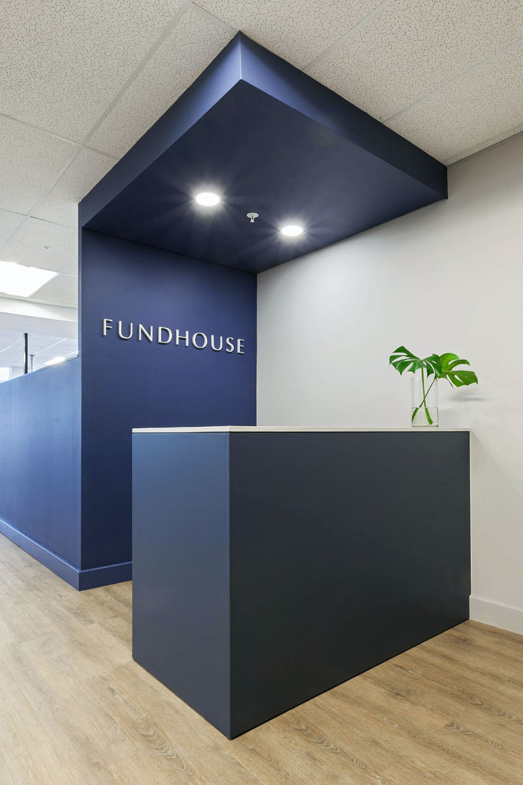
Fundhouse had recently rebranded and were quickly reaching capacity in their current office space. We were brought on board to design and install a new space that reflected their ethos of stability, transparency and clarity of vision. One that was future proofed for continued growth and aligned with their rebrand.
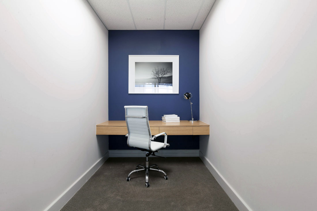
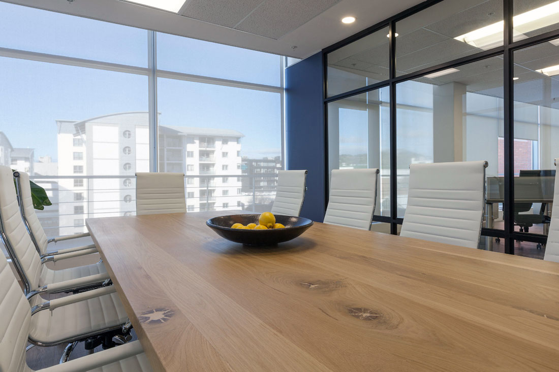
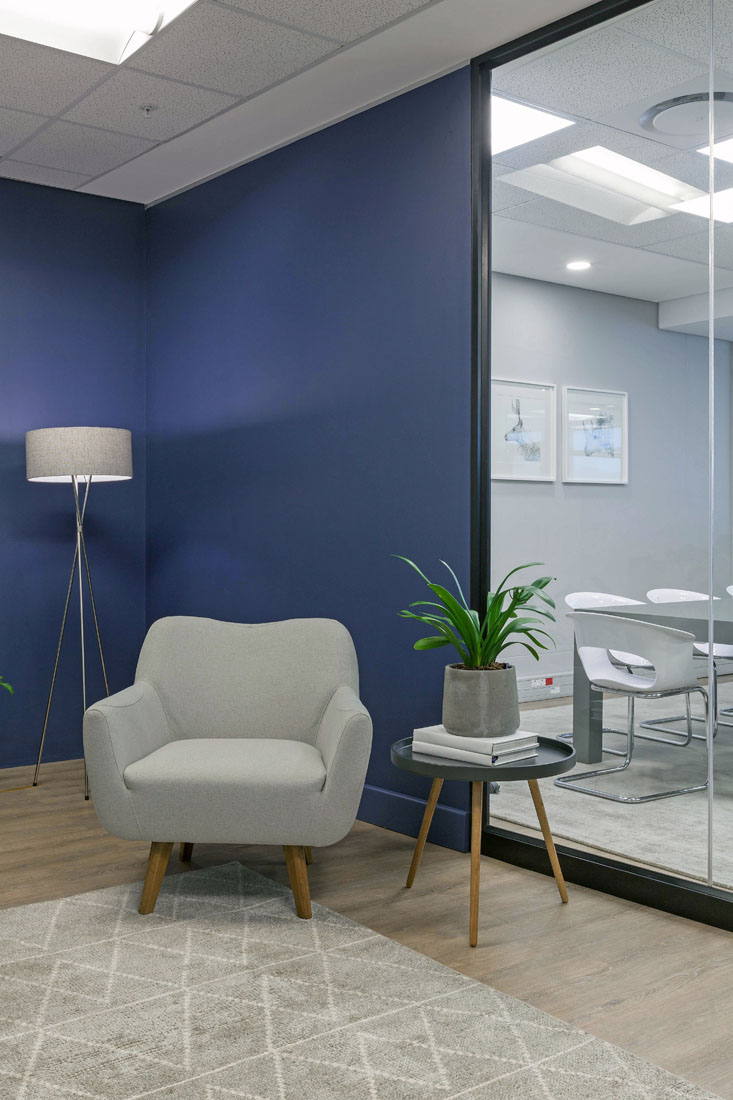
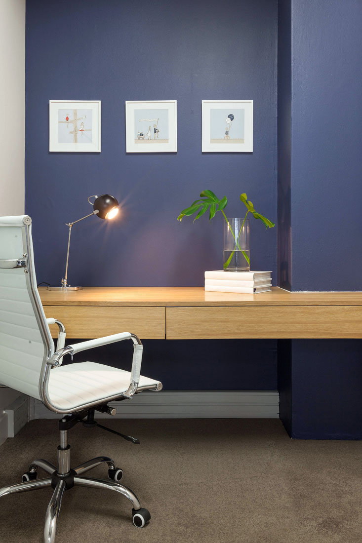
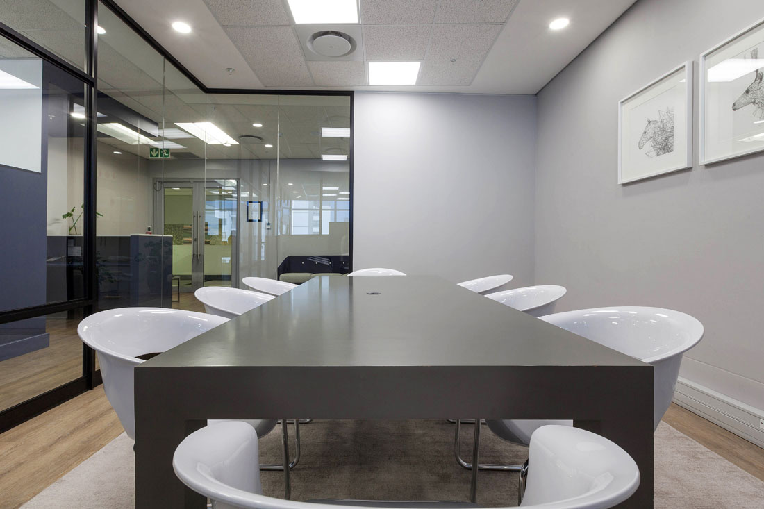
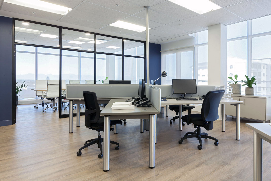
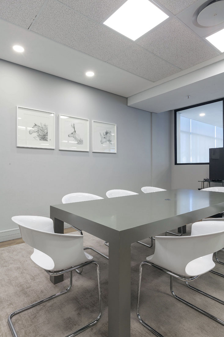
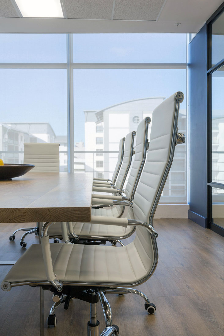
We achieved this aesthetic through a combination of design elements. Glass walled boardrooms were installed in contrast to navy blue feature walls and timber flooring. The open plan layout was punctuated by think tanks as breakaway spaces for privacy. The architectural lines of the new reception area were mirrored by angled desk hubs. These had the added benefit of maximizing space and allowing Fundhouse to expand over time.
For Project Enquiries, Kindly Contact: enquiries@xperiencemakers.co.za
Date:
2017
Location:
Claremont
Category
Creative Office

